It’s hard to justify Tahoe icons. Partendo dalle linee guida di interfaccia umana del 1992 di Apple, una analisi molto critica delle nuove icone in macOS 26 Tahoe.
Uno degli errori principali è inserire icone per ogni azione:

Anche se non esistono sufficienti icone comprensibili da corrispondere a ogni icona, con questi risultati:
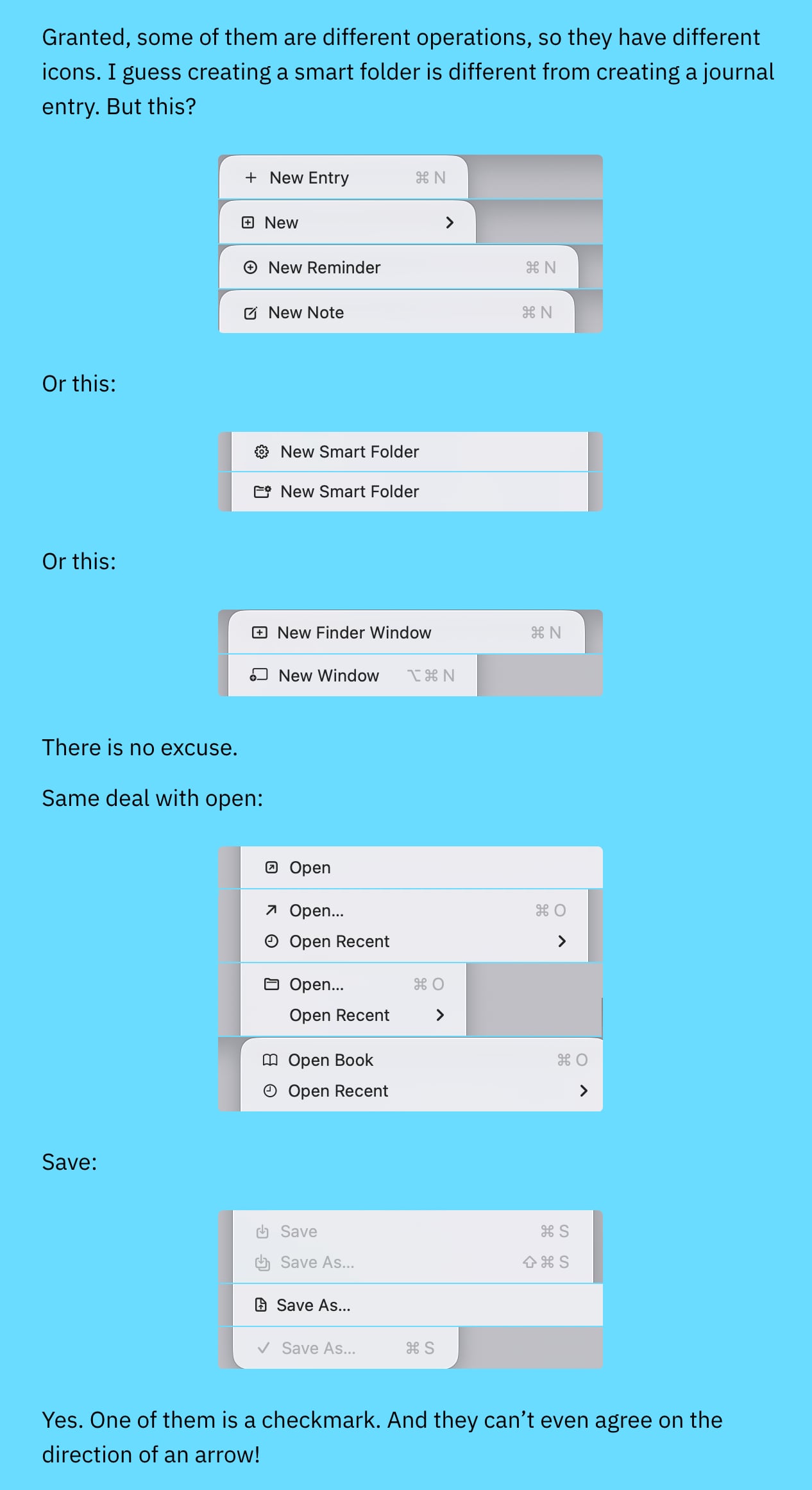
La conclusione:
In my opinion, Apple took on an impossible task: to add an icon to every menu item. There are just not enough good metaphors to do something like that.
But even if there were, the premise itself is questionable: if everything has an icon, it doesn’t mean users will find what they are looking for faster.
And even if the premise was solid, I still wish I could say: they did the best they could, given the goal. But that’s not true either: they did a poor job consistently applying the metaphors and designing the icons themselves.